Saturday, June 4, 2011

Term Project - Final Book

 
Cover

 Page Two and Three
Page Four and Five
Page Six
  Page Seven
 
  Page Eight

1.What skills that you acquired over the course of the term have been most helpful to you when it came to the book project?


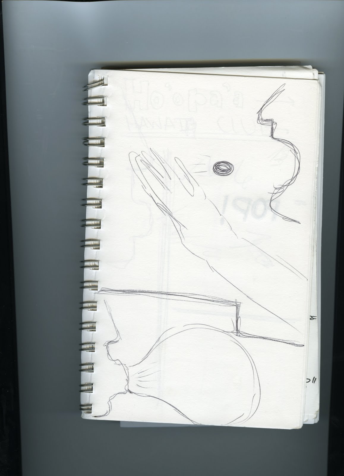
At the beginning of this class I have had knowledge of Photoshop based on the classes Introduction of Graphics and Graphic I had taken however I had learned from trial and error.  This class has taught me some of the basic things that I didn’t know of.  I learned how the use of multiply layers and grouping layers could really help work through a project.  I copy layer like no other now.  Also, I have really expanded the use of the select tool and cutting/copying.  It really helped with placing things in the hand in my book.


3.What did you learn about keeping on a production schedule (whether by doing it or not doing this time) when it comes to an ambitious design project?


I learned that working on an art or creative piece like a book you really need to me in the mood to work on an assignment like this, which might affect a production schedule.  I don’t have Photoshop on my personal computer so it was difficult to schedule time to work on the project when a lab with Photoshop was open. Also, it is difficult for me to be focus when I don’t have the flexibility of working on the project when I want to.  Focusing and setting time to work on project was difficult for me.  Also, when I do start to work on something I tend to really get into it and find it hard to stop working and it is difficult when the lab is closing or I have to leave.  I have learned from this assignment that it is really important to keep on schedule because then you have to time to make changes if need be.


4.What do you plan to do with your book (sell it, gift it, burn it, etc.)?


I have on plans for my book.  I probably will show it to some people to get feed back however I will not be printing or giving it to people.  
 

Term Project - Book Update

Cover
Page Two and Three
Page Four and Five
Page Six and Seven
Page Eight
Above is a scratched outline of the book. It is a child's book about bubble gum.  I decided to focus on bubble gum instead of a bouncy ball. I think all kids when they are young like bubble gum and think it is real special when they get to chew gum.  Chewing gum is such a "Big Boy/Girl" thing to do when you are little because most parent don't allow their kids to have gum because of the mess.  I think outline show how $0.25 can give so much joy to a child.  It makes me think about when I was younger and how it was a treat to get gum from the gum machine at the store or restaurant.  I would always ask my mom for $0.25 to get gum.  
I haven't started on creating the idea in Photoshop however I know have an outline and an idea where I want to take this book. 

Term Project - Book Propsal


When I started to think about what I wanted to do for my book I really struggled.  I couldn’t really think of a particular topic or a theme for my book. I know that I am a simple person and I wanted to do a book that really explained itself.  I am not a very strong writer or drawer so I am a little caution of the book project.  During the class lecture in which book project examples where shared I enjoyed the books that had minimal text and the simple use of pictures for the story. 
I would like to create a book that is simple where the pictures explain the story.  I plan on making a child’s book.  I am very open to story and layout ideas.  I will be using photos from the Internet to make the book.
I do have an idea for a book with a bouncy ball because I really enjoy bouncy balls.  I want to make it really colorful and fun for young kids with big pictures.  I am thinking maybe depicting the journey a bouncy ball takes all over the city, similar to the movie “Babies Day Out”.  The baby takes an adventure all over the city.  Maybe a kid will throw the bouncy ball and it will just bounce all over the city ending up back at home at the end of the story. 
I am still working on an outline for the story with picture ideas.  I often don’t really outline something but just work on it and ideas just kind of flow.  I really enjoy that part of creating pieces using Photoshop.

Project Four - Photos and Alphabet Soup

 Me
 A Friend
 A Stranger
 C
 F
 I
 L
V

1.     Which part of the project assignment do you feel you learned more from, "Picturing the Other" or "Alphabet Soup"? Why? 


I feel that I learned more from the “Alphabet Soup” apart of the assignment.  It caused me to look for something that normally isn’t there.  Trying to find letters in surrounding things is fun and a challenge. Also, making the letter you photographed apparent using Photoshop tools was a big learning experience. I got to experiment with a lot of different tool and layer adjustments that I didn’t use before.  I really learned how the tool affect the photograph.


2.     How did you approach your 'other'? Did you ask permission or not? Was the final photo you submitted a candid or a set-up?

My photograph of the “other” that I took was with out the permission of the person.  I was working at a yard sale for my Relay for Life and the man just walked up and started looking around.  I was first attracted to the man because he had a fanny pack.  I have been trying to bring the fanny back for the last couple of years.  The photo was candid while he shopped and did not have any contact with him.  He was very quiet and seemed very to himself.  He wasn’t very noticeable and I am sure that not many other people notice.


3.     Did you crop or adjust the final 'other' image in any way? If so, describe exactly which tools you used and what effect you intended by using them.


My final “other” image I did crop so the stranger would be on the right side of the photo.  I find that I enjoy images that are off set.  I also used the select tools to select the stranger to create a layer via copy.  I then changed the first layer to black and white by adjusting the effects on layer.  With the stranger layer I changed the color balance to make it image stick out more.  I really wanted to the stranger to be the factor that stuck out in this image but at the time it was taken he noticeable.  I wanted to change that by making him the focus by keeping him in color.
 

Project Three- Scratch


Questions

  • How were they different than working with continuous tones?
I am sure what this question is asking.
  • How did you choose which colors to work with? 
With the first picture I attempted to paint a picture that reflected the Super Mario Bros. game.  I used shapes, text, and the painting tools to make the pictures.  I decided on the colors based on the game and tried to keep it consistent.
The second picture is kind of like a little kids creation.  This picture is a very good example of the use of the paint brush with different brush heads, shapes, and the smudge tool.  I decided the colors on my own however I decided to pick similar shades.   
Lastly the third picture plays with the text tool.  I picked a font that seemed very old school college text, like letterman style.  I decided to use the letter “FU”.  When I made this picture I wanted to “FU” to some people so I decided to make something that kind of got that energy out.  I used bright spring colors to fill in the text. I got the color ideas from recent spring shirt designs that I saw in the Book Store. I decided to make the background color a deep blue to reflect an old university feel, like an old sorority jacket.
  • Did some color combinations tend to work better than other?
The only picture that I think really think works together with the colors is the “F U” picture.  I really like how it turned out.  With the other picture I don’t think some of the colors fit because they are different shades or saturation levels.

Wednesday, May 18, 2011

Project Five: Poster Project


Which two out of three themes of the project assignment did you choose and why?
 The two themes that I chose for this project was a poster for a fictional band and a propaganda poster for the upcoming Block Party on campus.  I decided to do a fictional band poster because all the posters that I see promoting other bands around campus and around town.  I thought that I would try to design my own poster for a band.  As for the propaganda poster, my sister who is co-coordinating the Block Party, asked me to create a poster for the event.  I actually created two posters for the event however the first one I didn’t like nor did the committee.
What compositional techniques did you employ to make your posters catch a person’s attention?
For the band (Purple) poster I used the constant color scheme of purple in the poster.  I also really got to work with layer styling and used the outer glow technique to make the photo and light sign pop out. This poster has a lot of texture with the background wallpaper and the wood gain at the bottom.  The poster is very all over the place however I think that is pulled together with the colors and style.
The Block Party poster is more informational.  In designing this poster I actually googled “block party” and got some ideas from other posters online.  I liked the simplicity of the posters I saw and the use of one image.  This poster contains a lot of information.  I like to work in black and I think the light color on top really pops and it is something that isn’t often seen.  I used the one picture of an old style lawn chair to reflect the meaning of the block party.  I think it represents the older generation bring out the old lawn chair to sit on the lawn watching young child play in the water from a broken fire hydrant while the mom’s are preparing the food.  I think it gives the ideas of how block parties were just what that happened every Saturday at the old neighborhood. Were families and friends came together to hang out.  For the poster I liked the repetition of the chairs and differentiation of colors. I changed the colors by playing with the saturation/hue on the layers.  I also posterized the chairs to give that grainy look.  I decided to use a real bold block text for the title (Block Party) and the day and date.  I used a simpler text to for the location, time, etc. information so that it is easier for the reader. I also stretched the text to fit the black rectangle hence all the different sizes and heights of text.  I think it works well.  I used spacing to group information together.  Example: “Stevenson Union Courtyard” it is all different heights and sizes however it is grouped together by the spacing distance from the time (4-7PM).  I think that it groups similar information together well.
How did you want your posters to affect your audience? In what ways do you think they succeed?
For the band poster I wanted the audience to think it was fun, edgy, and stylish.  I think the purple color really sets the mood.  Purple is such a mysterious color.  I used texture to spice up the poster more and give it that edgier feel.
For the Block Party poster I want my audience to go to the event.  I think the simplicity of the picture captures people’s attention. I like the postcard style of the poster with the fun stuff (like the hand written part of a postcard) on the left and the information stuff (like the address and postage) on the right.  It splits the design with the information.  I think this poster is fun yet gives the audience the information needed.

Sunday, April 17, 2011

Project Two - Collage


What was your process like working on the collage? Did you have a clear plan in mind and proceed smoothly to an end result? Or did you discover unexpected things as you played with the design?

While working in Photoshop I usually never have an idea what the outcome of the project will be.  I really enjoy not knowing.  Exploring and trying new things is the fun of it.  I started with one thing, usually a photo, and then the ideas.  After a little while an idea started to form but it was always changing.  I wouldn’t say I had trouble coming to a result however just kept playing around and changing thing until I liked the outcome.    

Were they stages where the collage was unsettling? Did you keep it that way? Why or why not?

In the first collage (the photo of me with the yellow umbrella), it is very apparent of the differences and done on purpose.  I think that the collage as a whole has a very good abstract look with the umbrella deflecting the water coming from the hose.  I kept the collage unsettling because the pieces obviously don’t fit however overall they do form an overall picture.  I really enjoy the outcome of this collage. 
The second collage (the ice cream stand), was total accident.  I started with the background photo of the ocean and cliffs and then added the rock climber.  The rock climber was a task to work with.  Making sure that the rock climber fits into the photo and keeping the proportions correct took some time.  Also, adding to his shorts was necessary to seem like he was climbing up the rock.  By adding the ice cream stand it made the collage more ironic and unrealistic.  I added the “Will Return…” sign on the ice cream cart to emphasis the stupidity of having an ice cream stand on top of a giant rock especially since no one is there.  The collage came out as a funny joke with a small tag line added.